

.jpg)

.jpg)
.jpg)


 copy.jpg)
.jpg)

.jpg)
.jpg)
.jpg)
What is the definition of a luxury car?
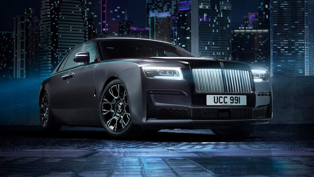
A luxury car can be defined in many ways. For some it’s a car that has a higher level of equipment, comfort and/or performance than an average car.
For others, a luxury car is defined by its price, with any vehicle more expensive than the mainstream offerings considered luxury. The Australian Taxation Office, as part of its controversial Luxury Car Tax, defines a luxury car as any that costs more than $76,950.
Why are they so distinct?
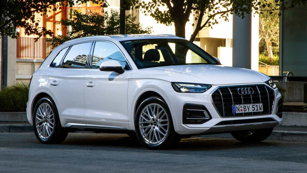
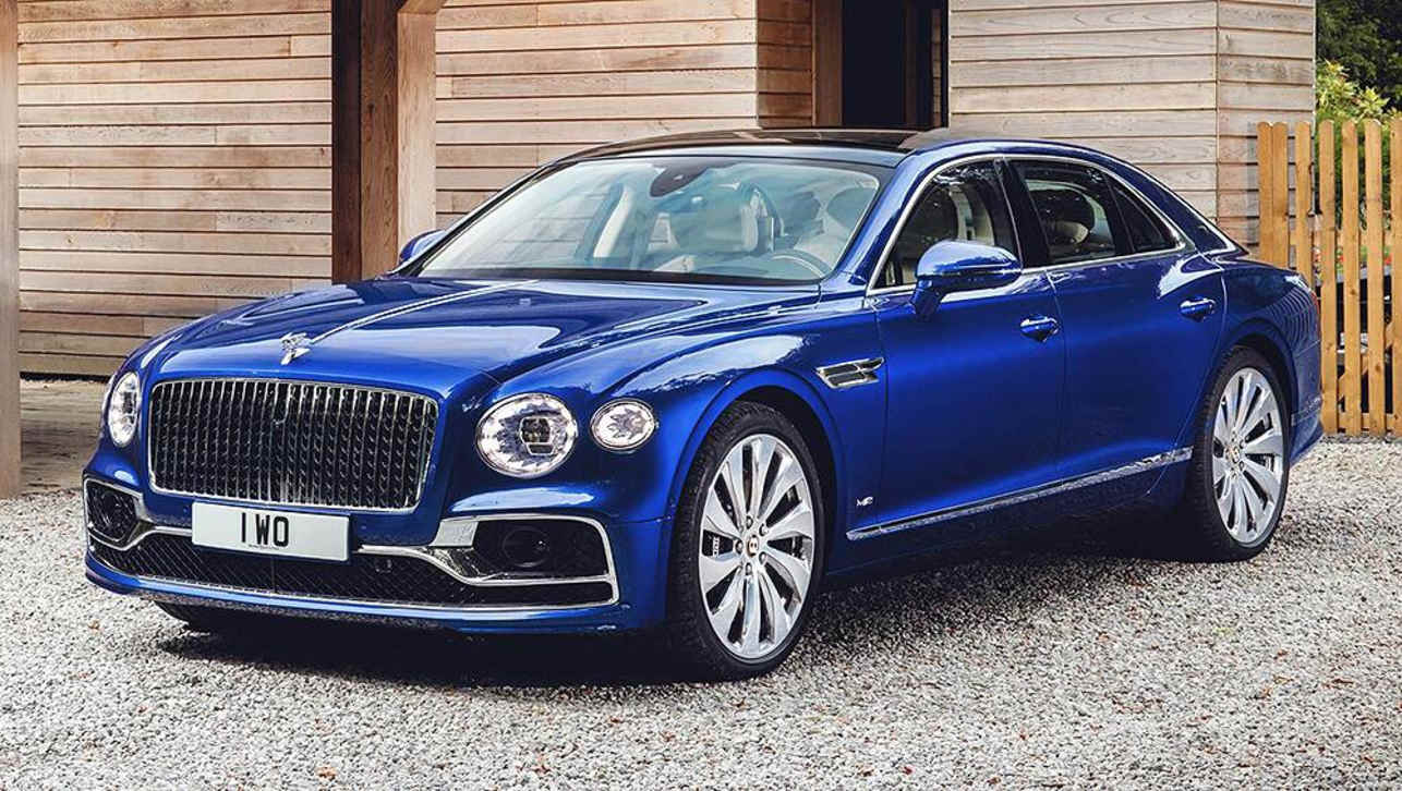
Being more expensive means luxury cars need to have more appeal and that has led to brands developing distinctive characters and design aesthetics for their model line-ups.
For example, Porsche makes dynamically sporty cars, whereas Bentley produces more opulent vehicles and brands like BMW and Mercedes-Benz cover a broad range.
How important are logos?
Luxury car badges help to define the brands and most have become iconic in their own right. If someone asks a car enthusiasts about the ‘car with horse logo’ most will know immediately you mean Ferrari.
What are some of the most well-known luxury car logos in the world?
Every car brand has a distinctive logo, even the luxury ones, so there are simply too many to go into here. Instead, we’ll list 10 of the most famous luxury car emblems and give you some history and detail around them.
1. Ferrari
.jpg)

.jpg)
The cavallino rampante is arguably the most well-known luxury car badge in the world. Better known in the English-speaking world as the ‘prancing horse’, Ferrari’s emblem is part of the cultural zeitgeist. The story behind the black horse has become famous in its own right, but we’ll tell it again. It was originally the crest of Francesco Baracca, an Italian fighter pilot in World War I. He was killed in 1918 and when his mother met young racing driver, Enzo Ferrari, in 1923 she told him to use the prancing horse as a symbol of good luck.
2. Porsche
While there’s some grey area, it’s widely held that the prancing horse at the centre of Porsche’s crest is actually the same horse from the Ferrari shield. The story goes that Baracca originally took his icon from the Stuttgart coat of arms (reportedly from a German pilot he shot down), which is also where Porsche drew inspiration for its badge.
While seemingly not an intentional connection, it’s a fitting irony that these two rival brands share a common link at the heart of their identity.
3. Audi
.jpg)
It’s one of the most famous luxury car symbols in the world, but do you know why Audi has four rings? You might think it has something to do with the Olympics, but you’d be wrong.
Instead, the story goes all the way back to 1899, when German industrialist August Horch started his first car company, naming it after himself. But when he left that company and started a second car maker in 1910 he couldn’t use his own surname. So he had Horch translated into Latin, which is Audi.
Over the next few decades the brand’s fortunes ebbed and flowed until the depression hit and in 1932 Horch and Audi merged with two other German car and bike makers, DKW and Wanderer to form Auto Union. The four rings are meant to symbolise the four separate brands that came together, interlinked to show the connection between each of them.
While the Auto Union name was used until 1969, when the Audi name took centre stage and has been used ever since.
4. Lamborghini
Some sports car logos have deep back stories that speak to the complex origins of the brand, such as Ferrari. That’s not the case with Lamborghini and its now-iconic rampaging bull.
Company founder Ferruccio Lamborghini was a Taurus, so he had an interest in bulls thanks to his zodiac symbol. Not only did he use a bull as his badge, he reportedly enjoyed watching bull fights and decided to name his cars after bull fighting connections, including Miura, Murcielago, Gallardo, Aventador and more.
5. Alfa Romeo
.jpg)
.jpg)
We have a delayed tram to thank for one of the industries most memorable logos. Designer Romano Cattaneo was reportedly waiting for his ride home in Milan, Alfa Romeo’s hometown, when he was inspired by the city’s biscione visconteo, grass snake, crest. He combined the green serpent, complete with a crown, with the cross with Milan’s flag (a red cross on a white background).
Early versions of the logo featured what appeared to be a man (or possibly even a child, according to some reports) being eaten by the snake. The company officially denies its logo is eating people and the modern version is simplified to the point it no longer looks like a human inside the snake’s mouth.
6. Rolls-Royce
.jpg)
.jpg)
You probably know the small sculpture that sits proudly on the front of Rolls-Royce vehicles is called 'The Spirit of Ecstasy'. But did you know the forbidden romance behind it?
The legend goes that when John Walter, 2nd Baron Montagu, wanted a personal emblem for his 1909 Rolls-Royce Silver Ghost he commissioned a sculpture of his secretary, Eleanor Velasco Thornton. What the Baron didn’t publicise at the time was that he was having a long-term affair with Miss Thornton.
The original sculpture of Thornton was actually called ‘The Whisper’ as it featured her with a finger to her lips, in a nod to their secret affair, but it still had the flowing robes that would become a Rolls-Royce signature.
In 1911 Rolls-Royce wanted a permanent badge for its models and asked Walter if it could use a modified version of ‘The Whisper’, which now featured the female figure with both arms back with flowing robes behind her, it was dubbed The Spirit of Ecstasy and has been a part of the brand ever since.
7. Mercedes-Benz
.jpg)
.jpg)
The German brand is one of the world’s leading luxury car makers, but as its famous logo betrays, the company’s founder, Gottlieb Daimler had even grander visions. That’s because the now-iconic three-pointed star was created to represent land, sea and air, the three areas Gottlieb envisioned his engines dominating.
The final piece of the modern badge came in 1926, when Daimler merged with Benz, with the newly formed Mercedes-Benz enclosing the three-pointed star in a ring to signify the unification between the two companies.
Mercedes-Benz may not power everything on the sea and air, but it has done a very good job on the land.
8. BMW
.jpg)
.jpg)
The logo for the Bavarian Motor Works is meant to signify a spinning aeroplane propeller, right? Wrong. BMW historians have made it clear the propeller symbolism is wrong, but it’s an urban legend that persists. In part because some early BMW ads actually integrated the logo onto images of plane propellers - so, in reality, the company only has itself to blame.
As for the actual history of the badge. The famous round, blue and white badge comes from the coat of arms of its native Bavaria (you may be noticing a coat of arms theme at this point). BMW chose its particular propeller-like pattern for the blue and white specifically to avoid copying the coat of arms too closely, as this was against the law.
9. Cadillac
Antoine de la Mothe Cadillac was a French-born explorer of what was then known as New France, but is now known as Canada and the USA. He is credited with founding the city of Detroit in 1701, so it’s appropriate that when the car company was born and wanted to create a premium image it called on the French aristocrat’s coat of arms. The intricate detailing is meant to symbolise the six ancient courts of France, while the shield-like shape of the badge is also a further nod to nobility.
10. Polestar
.jpg)
While most of these other brands have been around for decades, Polestar is one of the newest luxury car companies in the world. While you could dismiss it as the brand with the 'plus sign' car logo it’s actually an interesting look at how carmakers create identity.
The plus sign is meant to represent two arrows pointing at each other to make a star. The star pre-dates Polestar’s launch as its own brand, going back to its short-lived era as Volvo’s performance division. Back then, the badge featured the word ‘Polestar’ and a star on a bright cyan background. This wasn’t considered premium enough, so the star became the centrepiece and was simplified for a more elegant look befitting a luxury car brand.


.jpg)

.jpg)

Comments